Schedulemaster Dashboard
Purpose: Personal project
Project Type: NextJS, D3.js, NoSQL, TypeScript
Date: Spring 2022
A dashboard that to the API of Schedulemaster, a scheduling software used by various flight schools, to visualize data relevant for a flight school.
Purpose
During my time at a flight school, one of the aircraft had been accidentally overflown; each aircraft needs to go for maintenance every 50 flight hours at that school, and the system for keeping track of the times was a purely paper log. One of the instructors discussed wanting an obvious warning for students if the aircraft they were about to fly was low in hours remaining.
A walkthrough
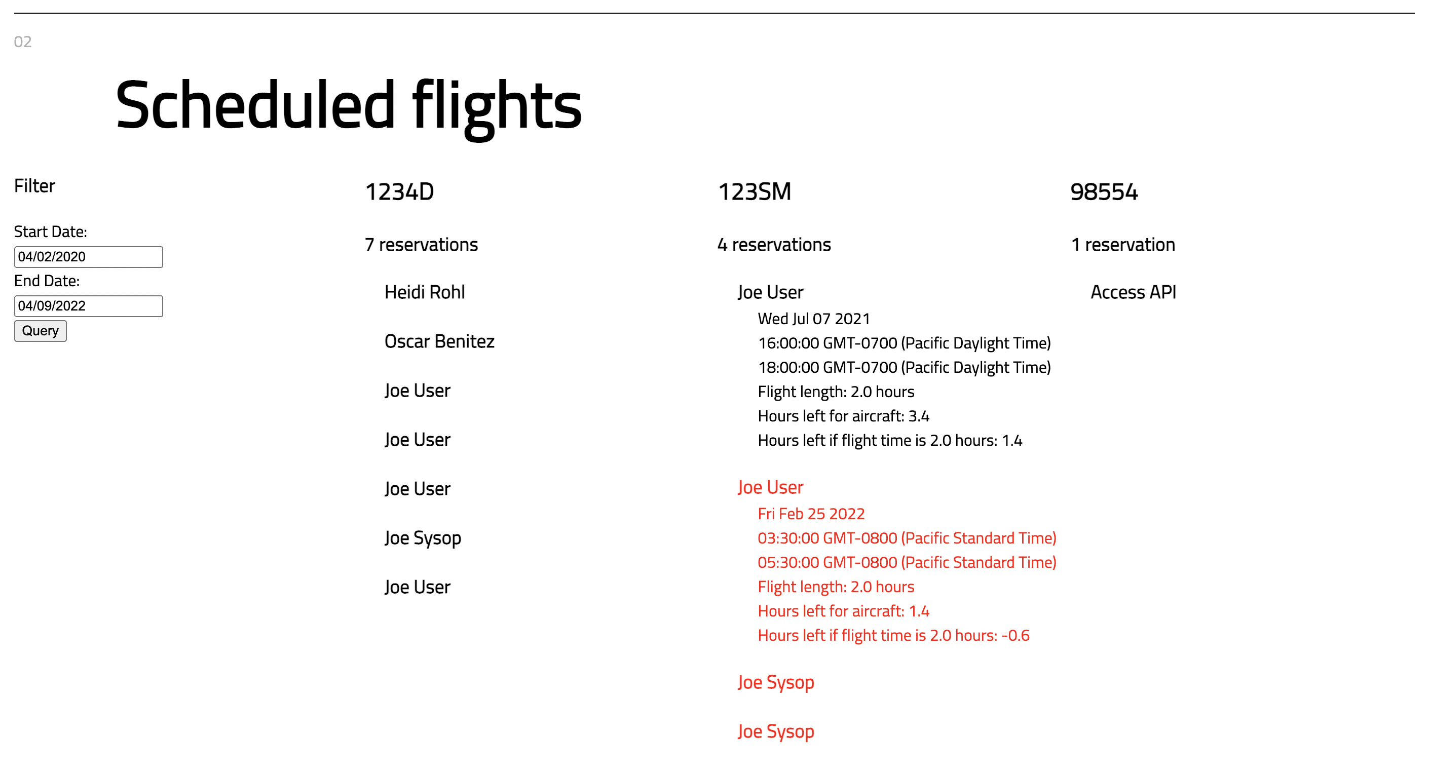
I used the Schedulemaster API which exposes scheduling information to highlight when someone was at risk of overflying an aircraft based on schedule lengths. The front-end queries through a Python Flask API which handles authentication to the Schedulemaster API and allows for more in-depth data processing should this project be extended in the future. Due to Schedulemaster not keeping track of how many hours are left until maintenance is required, a NoSQL backend was created on Firebase where the admin of the flight school may update the hours remaining, and this would be used to calculate when a scheduled flight might be at risk of overflying the aircraft.
The hours remaining on the aircraft are easily editable, as flights are commonly not exactly the same length as scheduled, and thus as a day progresses it's possible that the actual number of hours left on an aircraft becomes desynchronized with the value on the Firebase backend. Flights will typically be of equal or lesser length than the schedule's length, so it's assumed that each flight will take the entire scheduled length. The first schedule highlighted in red would then be the one that wouldn't be possible due to a lack of hours on the aircraft. Each name can be clicked to view details about the schedule. The sample data is from Schedulemaster's sample club, and thus is sparse; a very large range is used in the time filter, but if using real data one would likely only be viewing the next week or so.

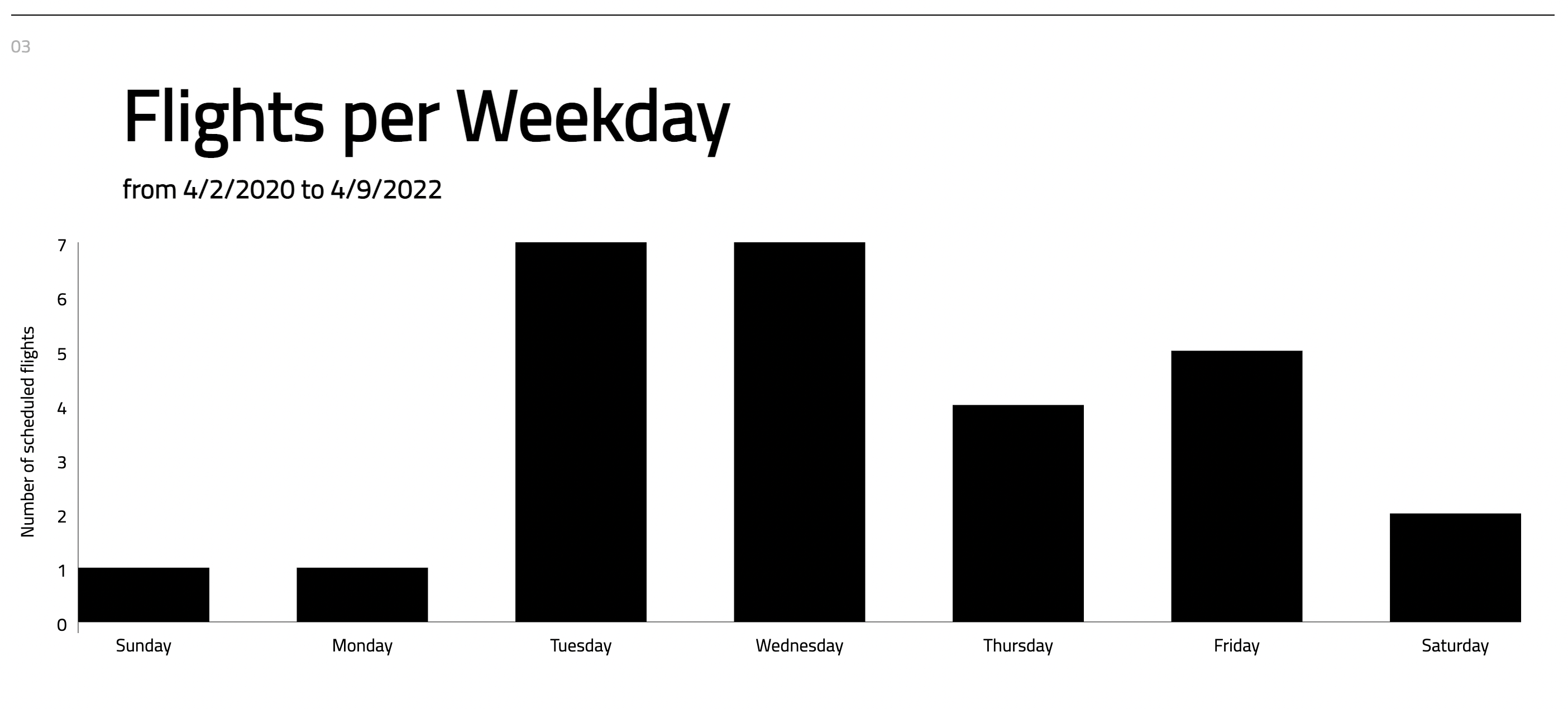
At the bottom of the homepage, there are then some various data visualizations based on available data in Schedulemaster. These were done with D3.

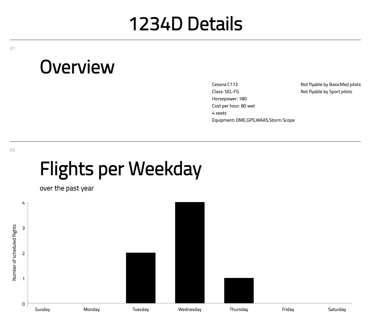
Clicking through each aircraft in the first section also gives some more details about each aircraft as well as a visualization of number of scheduled flights vs weekday over the past year.
