League of Legends Player Stats
Purpose: School project
Project Type: R, Shiny
Date: Spring, 2020
A dashboard providing insights for a player's statistics in the video game League of Legends. Done for a school project utilizing R and Shiny for data visualization of Riot API data.
Done for Informatics 201 at University of Washington, this was the final group project built using R and Shiny. The purpose was to demonstrate knowledge in data manipulation, analysis and interactive data visualization.
Basic Statistics
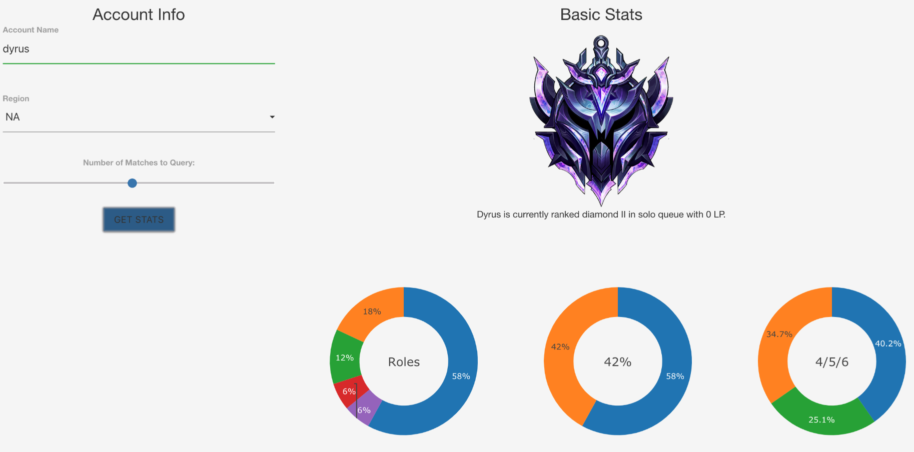
The first page has an input box on the left allowing the user to input an account name, the region the account belongs to, and the number of most recent matches to pull statistics from. One submitted, an overview of player statistics including their current rank, their most commonly played roles, winrate, and kill/death/assist ratio are displayed.
Table of Statistics
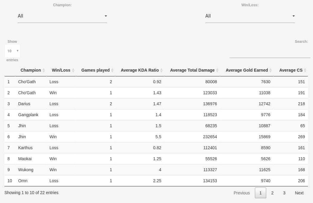
A sortable and filterable table allows for users to view exact numbers if they're curious, and sort based on various factors if they're looking for a list which may be more easily provided in table form compared to a visualization. The statistics are split into games won and lost, and averaged out over all recent games of that champion that were won and lost.
Recently Played Champions
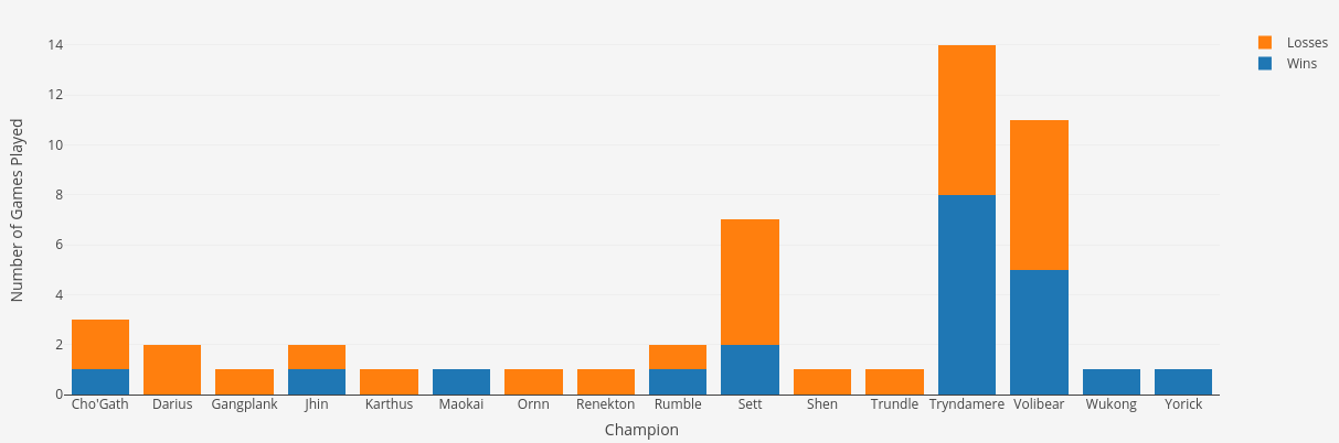
A frequency chart of the player's recently played champions are split into wins and losses providing an effective overview of which champions may be the most successful or unsuccessful for the player.
Time of Games
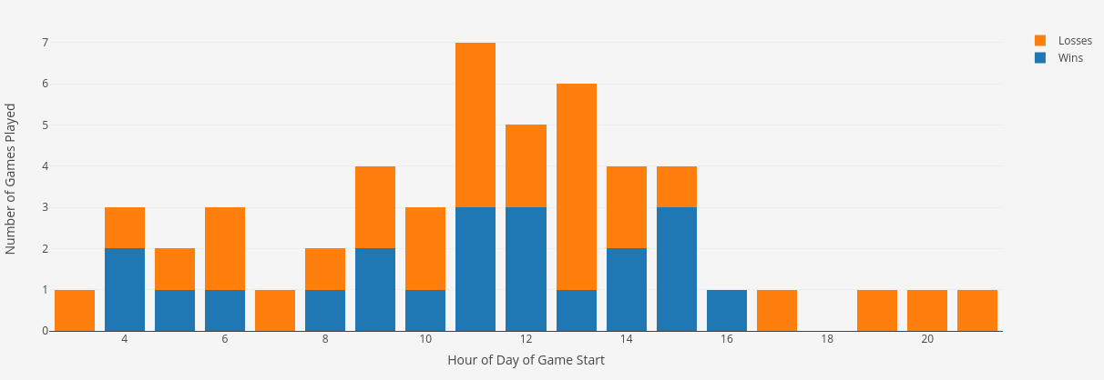
Here, a graph of when the player started their games are split into wins and losses, letting players see if there's a particular time of day that may be more successful than another. For example, perhaps a player finds that playing in the morning leads to better win/loss ratios than late at night.
Comparison of Won vs. Lost Games
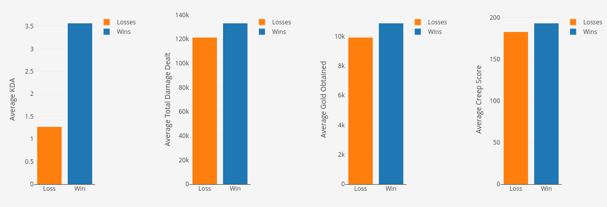
A couple of key statistics are averaged out over all of the games the player has queried for in the landing page, and compared over the games they won and lost. This may lead to analyzing which areas of gameplay a player may be lacking in by looking at correlations between averages in the games they won vs lost.
Trends
Various variables such as but not limited to Minion Score, Damage Dealt, Kills, etc. are plotted by either game number or date, where game number linearly spaces out the games with the most recent on the right, and the oldest on the left of the x-axis. The individual points are colored to represent games won and lost as well.
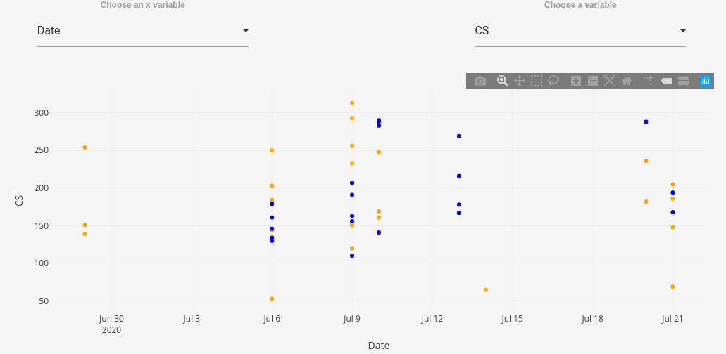
Date allows for players that may play the game in clusters with long breaks to analyze possible effects of their pause in playing, and may be more accurate in displaying trends than the linear spacing.
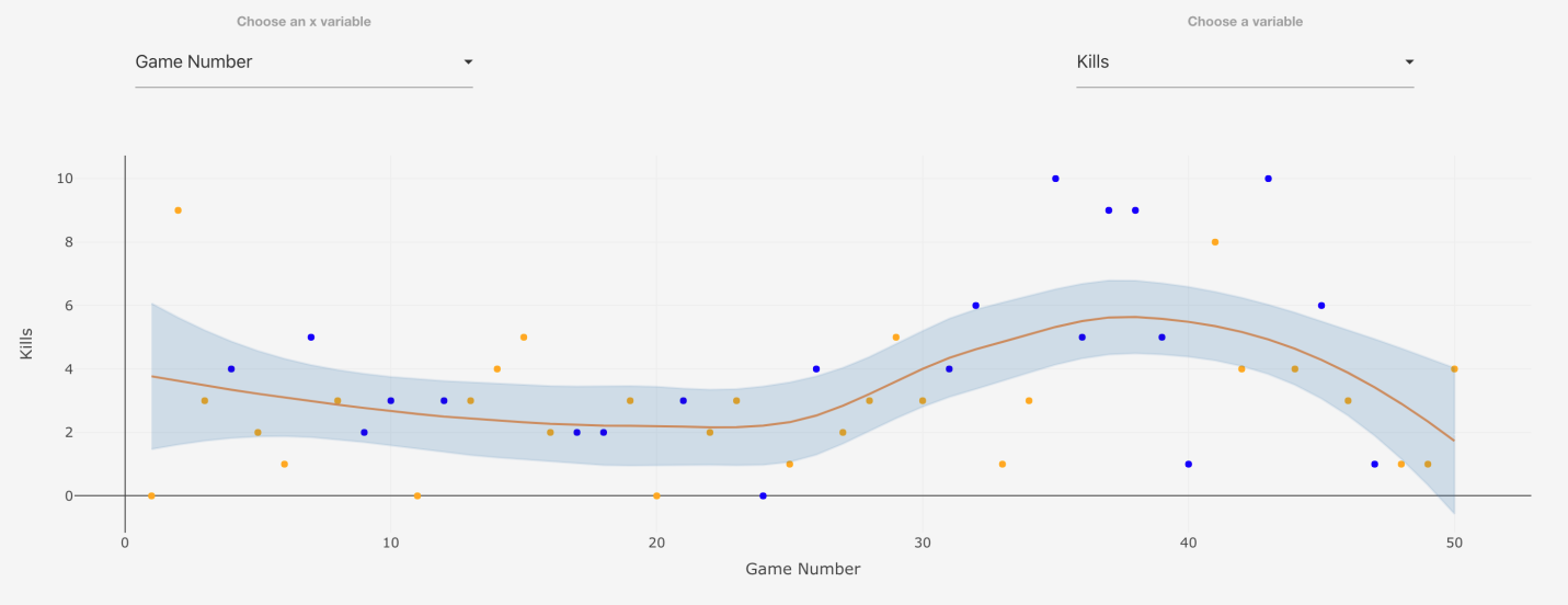
When plotted linearly, a curve fit with standard error allows for quick understanding of possible trends in the selected statistic